1. Executive Summary
This case study explores alert creation as a platform capability for operational trust. The work was not a notification redesign. It was a strategic exploration for how a complex platform could help users configure meaningful alerts across product surfaces without creating another ignored message stream.
The central question was:
How do we turn system risk into configurable, actionable alerts without creating another ignored notification surface?
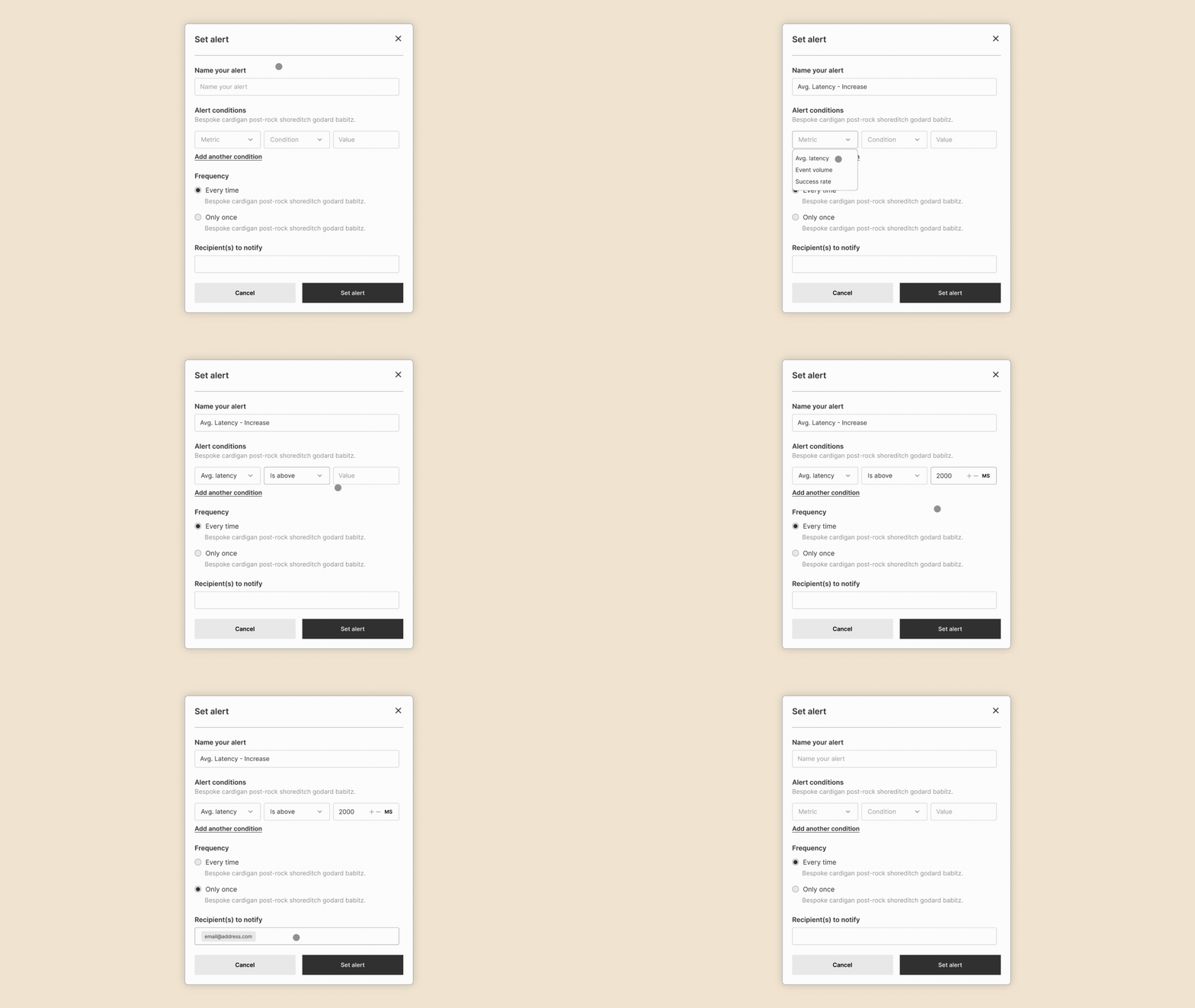
My strongest contribution was the alert creation and configuration experience: how a user could define a metric, condition, threshold, channel, frequency, and alert name from the context where the risk appeared. I also explored how alerts could be surfaced globally without blending into ordinary notifications.
2. System Context
The product already had a global header notification pattern, but important operational signals could be easy to miss if they behaved like ordinary product messages. A failed data sync, degraded journey performance, campaign delivery issue, or integration warning needed a different model than a routine update.
The opportunity was to treat alerting as reusable platform infrastructure:
Product signal
-> Contextual alert creation
-> Configurable severity and frequency
-> Global alert visibility
-> Actionable operational workflow
The exploration focused on marketers, customer-facing teams, product partners, engineering partners, technical contacts, and operators who needed to know when a system risk required attention.
3. The Real Problems
Critical signals were not all the same. Some needed immediate interruption, some needed lightweight awareness, and some only needed to be available when a user reviewed system health.
Notification surfaces were already easy to ignore. If alerting became just another item inside the same feed, users might miss the exact signals the system was trying to elevate.
Alert creation needed to be understandable to non-engineering users without flattening the technical logic underneath. The UX needed to translate conditions, thresholds, destinations, and frequencies into a workflow that felt configurable rather than intimidating.
Different product surfaces created different alerting moments. A user discovering a risk inside journeys, integrations, campaigns, or data health should not have to leave context and rebuild the signal from scratch somewhere else.
4. Design Principles
- Create alerts from the context where the signal appears.
- Treat alerting as configuration UX, not message composition.
- Separate alerts from ordinary notifications without hiding them.
- Give severity a clear behavioral meaning.
- Design against alert fatigue from the beginning.
- Preserve enough structure for engineering and product teams to reuse the model across surfaces.
- Make every alert answer: what changed, how serious is it, and what should happen next?
5. Major Decisions
Make Alert Creation Contextual
The alert creation entry point should live near the product surface where a user discovers the signal. A user looking at an integration, campaign, journey, or data health surface should be able to create an alert from that context with relevant defaults already implied.
This reduced the cognitive jump from "I see a risk" to "I want to monitor this condition."
Treat Alert Creation As Configuration UX
The strongest pattern was a structured builder rather than a freeform notification composer:
Metric -> Condition -> Threshold -> Channel -> Frequency -> Alert name
The model was inspired by mature alerting systems where users configure a monitored condition and decide how often they should be notified. The goal was not to copy another domain; it was to borrow the clarity of condition-based alerting and adapt it to product surfaces where risk appears.
Separate Alerts From Notifications
The direction kept a single global header entry point, but separated ordinary notifications and alerts into distinct tabs:
Global header
-> Notifications
-> Alerts
This made alerts more visible without forcing users to learn a second global destination.
Introduce Severity Levels
Severity needed to shape both communication and interruption. The model used three levels:
- Critical: immediate attention required.
- Needs Attention: meaningful issue or degraded state.
- Informational: useful system signal, but not urgent.
Not every signal deserves the same level of interruption. Severity helped the system avoid treating every product event as equally important.
Design Against Alert Fatigue
The exploration separated two types of control:
- User-controlled levers: channels, frequency, thresholds, naming, and subscriptions.
- System-controlled levers: severity defaults, deduping, escalation, grouping, and limits on noisy signals.
Alerting only works if users trust that the system is not asking for attention casually.
6. System Evolution
The exploration moved from a simple notification question into a platform model for operational trust:
Global notifications
-> Alert-specific visual treatment
-> Contextual alert creation
-> Configurable alert builder
-> Severity and frequency model
-> Reusable alerting platform capability
The key shift was away from "where should this message appear?" and toward "what system risk should be monitored, how should it be evaluated, and when should a human be interrupted?"
7. Collaboration Model
My role was early vision and prototyping. I explored the alert creation dialog, configuration UX, alerts versus notifications, global surfacing, visual distinction, severity models, and surface-specific alert creation flows.
Collaboration centered on turning a broad alerting idea into concrete product decisions: what users configure, how alerts differ from ordinary notifications, how severity should behave, and how the pattern could be reused across product surfaces.
8. Results
Product outcomes:
- Framed alerting as a reusable platform capability instead of a one-off notification feature.
- Defined a configuration model for alert creation.
- Clarified the distinction between ordinary notifications and operational alerts.
- Identified severity and frequency as essential controls for trust.
- Created a stronger foundation for product, design, and engineering alignment.
Qualitative outcomes:
- Clarified alerting as a reusable platform capability instead of a one-off notification pattern.
- Created a clearer configuration model for condition-based alerts.
- Helped teams reason about severity, frequency, and interruption before implementation details dominated the conversation.
9. Design Tensions
- Balancing user-configured alerts with system-owned alerts.
- Calibrating severity without creating unnecessary noise.
- Giving marketers meaningful control without making alert setup feel technical.
- Keeping global alert visibility coherent with surface-specific context.
- Preventing duplicate or conflicting alerts across teams.
10. Reflection
The most important lesson was that alerting is not simply about visibility. It is about trust in interruption.
If an alert fires too often, users stop believing it matters. If it fires too quietly, the product fails at the moment it is most needed. The design problem sits between product strategy, system behavior, and human attention.
11. Reusable Patterns
- Contextual alert creation.
- Condition-based configuration builders.
- Severity models tied to product behavior.
- Alerts separated from ordinary notifications.
- User-controlled and system-controlled fatigue levers.
- Surface-specific defaults.
- Operational trust through monitored conditions.
- Concept model as stakeholder alignment tool.
12. Lessons That Carried Forward
This work connects to the same platform UX questions behind integration health, data ingestion, and observability: how does a complex system communicate risk in a way people can understand and act on?
The strongest pattern carried forward is that operational UX should not only expose system state. It should help users decide what deserves attention, what can wait, and what action should happen next.

